Tanqueray London Dry
Botanicals, refined
01Challenge
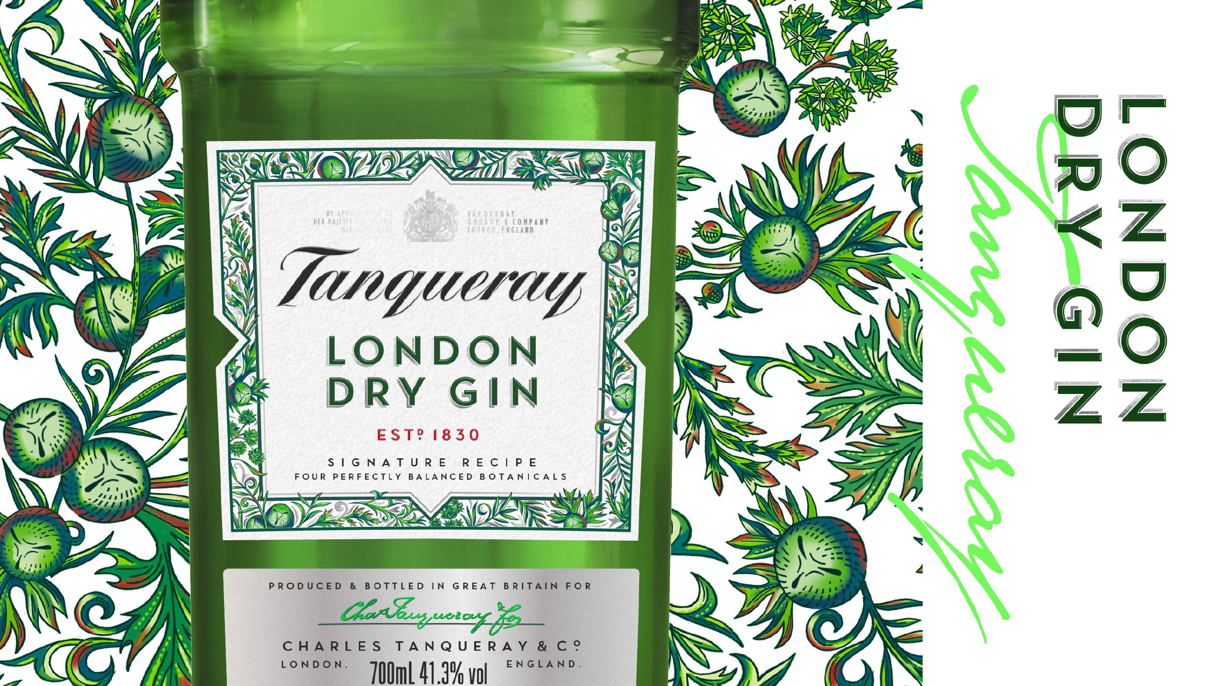
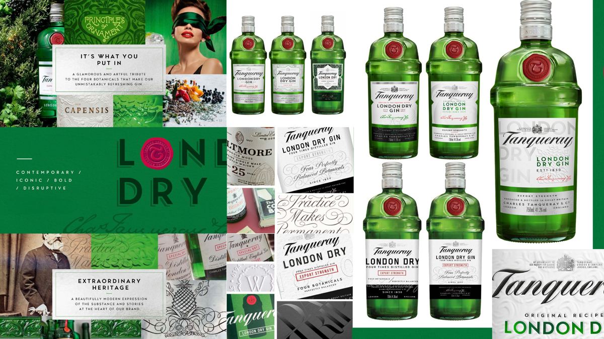
This project redesigned the label for Tanqueray London Dry. The first phase explored four routes: contemporary, iconic, bold and disruptive. The challenge was to find the right balance between them. The design had to refine the script, typography and botanical detail without losing what makes the bottle recognisable.
02Idea
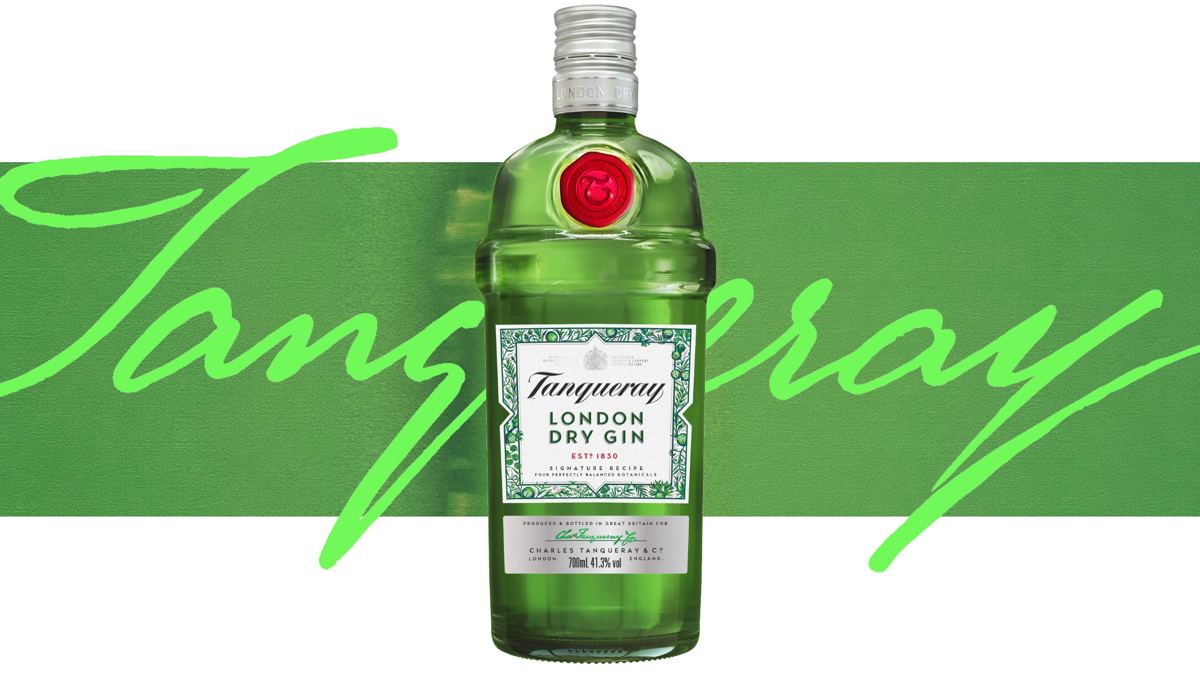
Botanicals, refined. The redesign looks to the gin's botanicals for its detail. A new botanical illustration and pattern frame the label. The script and typography are refined for clarity and craft. Together they give the bottle a richer, more crafted feel, while keeping its familiar character on the back bar and the shelf.
03What I did
I led the design direction, from initial concept development to presenting to the client. I directed the Phase 1 exploration across four routes. I then directed and designed the label redesign, the botanical illustration and pattern, and the refinement of the script and typography.
04Craft & deliverables
- Phase 1 routes: contemporary, iconic, bold, disruptive
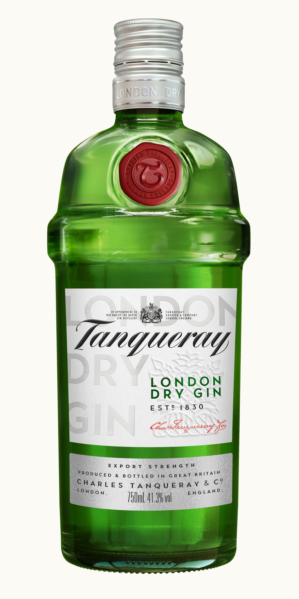
- The hero bottle
- Label redesign
- Botanical illustration and pattern
- Script and typography refinement
Outcome
The work runs from Phase 1 routes through to a hero bottle and finished label artwork.